Week 3: Quantified Self.
This is the first week of Zoom classes. That also means this is the first week I am touching the homework that I had not one but two weeks of Spring Break to complete. During this first week “back” in classes, I am being asked to think about the “Quantified Self”.
While we might think of self-tracking as modern concept with Fitbits, Apple Watches, and the general Internet of Things, the concept of self-tracking reaches much farther back. My first experience with wearable self-tracking was pulling the Kellog’s-branded plastic pedometers out of a box of Rice Krispies and vigorously shaking it to count more steps than my sister.
My first experiences with self-tracking at all probably goes back to my days in Montessori schools as a child making birthday timelines – long blue strips of paper with a photo for each year, tracking my age. For each year of life, I ran a circle around the classroom as my friends and teachers sang:
The Earth goes around the sun tra la la
The Earth goes around the sun
The Earth goes around the sun tra la la
And Juliet is 1…
adding a year for each circle around the class.
Self tracking is something I think we all do, whether we realize it or not. But with the concept of the quantified self, I believe a sense of intentionality comes in that separates idle tracking from self quantification. With the quantified self, we’re trying to pick up on patterns, understand things about ourselves, and in some cases we are looking to change our behaviors. As someone who loves data, I’ve done a lot of self tracking just for the fun of understanding my behaviors and how they change. As someone with a chronic illness, self-tracking has also, at times, been important to my health, asking questions of the data such as How do the things I eat affect the way I feel? How does the way I move change my symptoms? Are certain medications making me feel better or worse? Am I sick or did I just eat too much ice cream? Since the start of quarantine, I’ve not found myself doing this as much. Perhaps (definitely) because I would recognize how little I’m doing (or, contrarily, how much sitting around I’ve been doing). But much like the little Rice Krispies pedometer, I have a handy little device in my back pocket at all times tracking much of what I do all day – probably more than I know about.
As I’ve been sitting around in quarantine, my phone/watch has been collecting the following data without me even needing to do a thing:
- steps
- screen time
- location (sometimes)
- notifications received
- social media habits
- audio levels of my headphones
- audio levels of my environment
- heart rate
- hours spent standing
- flights climbed…
The list goes on and on and I’ll probably never know its extent. The only one I’ve been paying attention to since I began quarantining is my steps. I find that when I don’t move enough I, like most people, get antsy and generally unpleasant to be around. Considering that COVID is out there testing relationships and I’m in here living with my girlfriend, I am trying to make sure I am at least moving a little each day. With an app called QS Access, I was able to download some of my Apple Health data to look at how I’ve been moving around and compare it to my life of freedom before quarantine. For simplicity’s sake and fair comparison, I’ve decided to look only at data beginning 09/01/2016 – my first year of college. Or… at least that’s what I was going to do until I found out that for some reason I don’t have that data. So we begin in March of 2017.
Because there is so much data here, I made these graphs in RStudio instead of by hand. Let’s look at the first one:
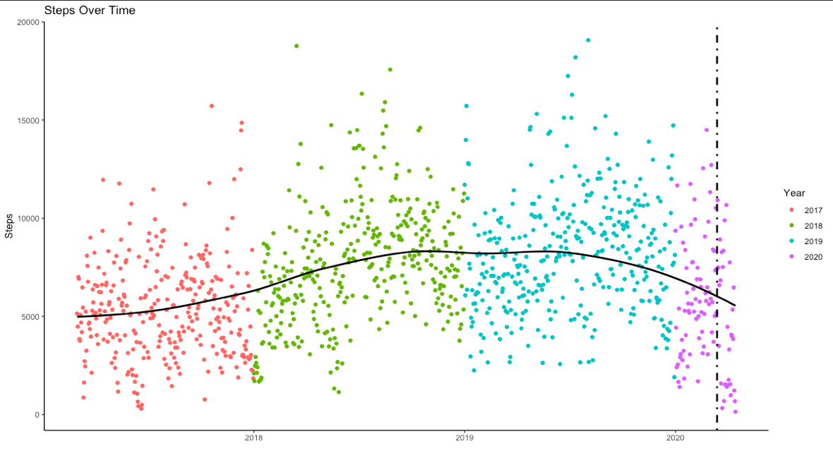
In this graph we can see how many steps I took each day from the start of 2017 through today. The vertical line shows the start of quarantine and the horizontal line shows the trend of how my steps increase or decrease over time.
What I take away from this graph is that I started walking more in college as I moved farther from campus. Nothing too shocking. There is a slight downtick toward the start of quarantine. Let’s take a look at that.
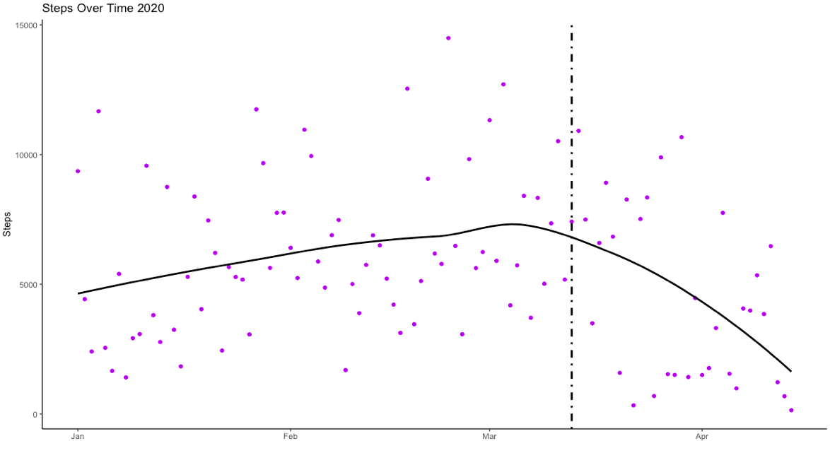
Okay. This graph is more interesting. We can see right before I begin quarantine, there is a slight increase in steps, and right when the quarantine begins, the trend turns downward. Here’s how I explain that – right before quarantining, Gillian and I went up to northern Minnesota (and Canada for a second because why not?) and were hiking a lot. Then, suddenly, quarantine begins and although we’re still taking walks, I can tell from this graph that it’s not enough to compare to my walking pre-COVID. Something to work on!
Finally, I looked at my social media usage. How much time do I spend on each platform? Here’s what I found in the Screen Time data from my phone:
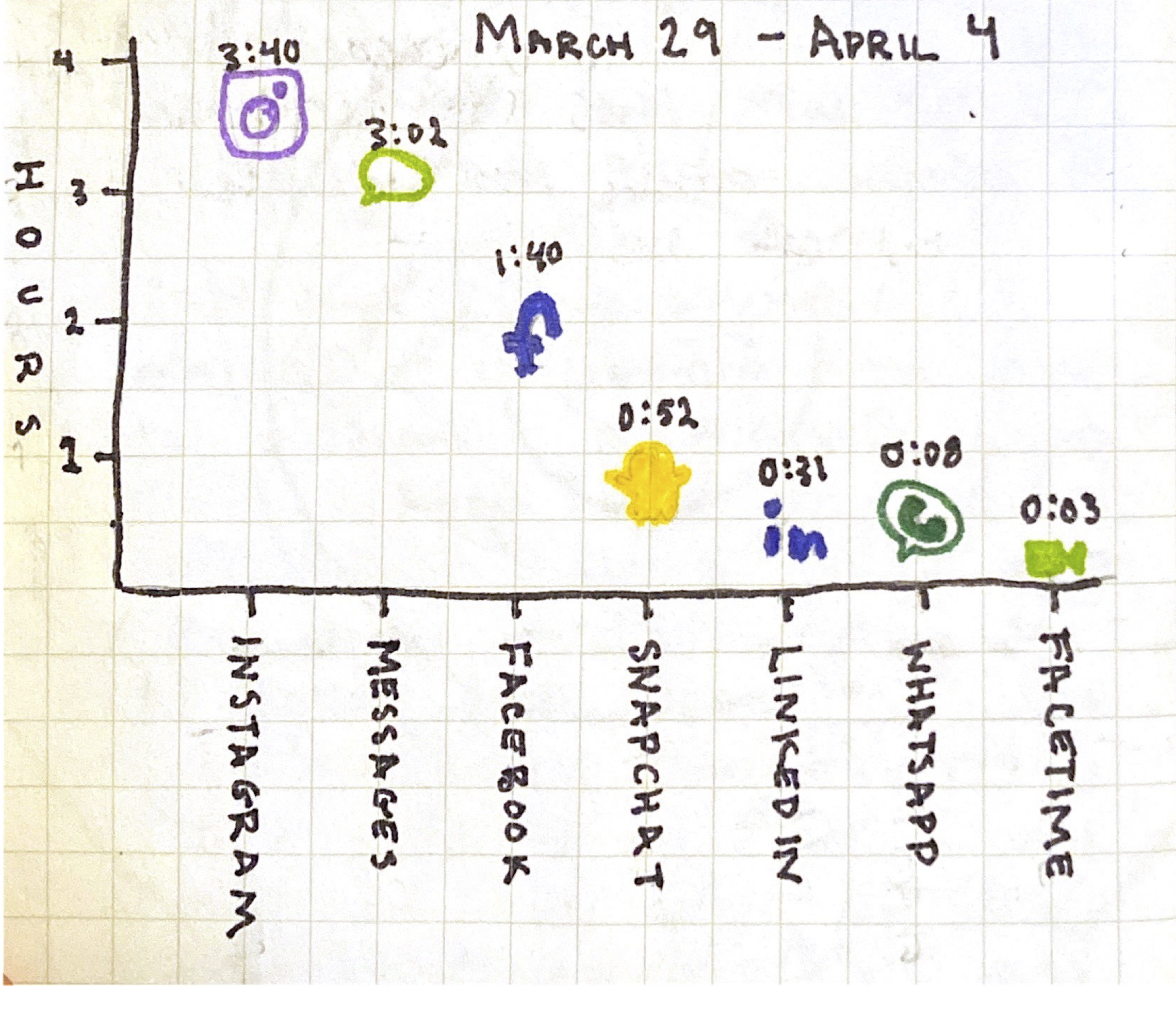
Keeping in mind that this is the data for an entire week of self-isolation, I’m not too disgusted by my exorbitant use of social media on my phone.
Here are my takeaways:
I expect this to change a lot. Why? Gillian moves back to North Carolina at the start of the week meaning less face-to-face communication. Given that this graph includes Messages and FaceTime as social media (which I’m not sure I agree with in the modern interpretation of “social media”, but Apple will do what it wants), I imagine that those two will increase significantly as my media of communication change from exclusively in-person, to messaging and FaceTime-ing. Later, when I return to Chicago, I anticipate Messages to go back down because most of my texting is to my family who I will be trapped in an apartment with.
I’ll keep track of these because my phone will do it regardless of if I want it to or not, and we’ll see if I’m right. For now, I think I’ll take a walk.
This is the first in a series of posts From Quarantine. Most posts from quarantine are prompted by Aisling Quigley’s Data Storytelling class at Macalester College. This is one of those posts.