Week 6: Text Analysis.
This week, we’re focusing on text analysis. Aisling has asked us to take some of the reflections we’ve done since the start of remote classes and put them into the website Voyant to see what insights we could gain. I tried this with all of my blog posts and found that my top 3 words were “data”, “quarantine”, and “group”. Not surprising to me, but still, it is interesting to see that the words that follow those top 3 are the names of the people I’ve been with throughout this quarantine process.
I find text analysis to be a very interesting topic in data analysis. Although it’s an area I don’t have much experience with, it’s something I’ve been experimenting with on my own time and want to learn more about. I used this week’s assignment as an opportunity to do that. To start, I did a sentiment analysis of my blog posts using the R package syuzhet. This package is very easy to use and because I just wanted to do a simple analysis, I didn’t get too deep into the “behind the scenes” aspects of sentiment analysis for this project.
The first thing I did was get a basic overall understanding of the different sentiments found in my blog posts:

Okay… the highest value that comes back is positive but that is closely followed by negative. What does this mean? How does it work?
What’s happening here is that there is a dictionary of words for each category. For example, words like “good”, “happy”, and “smile” might be in the positive dictionary whereas words like “bad”, “unhappy”, and “frown” might be in the negative dictionary. The text is read one word at a time and if that word is found in one of the dictionaries, it gets counted. Here’s an example:
Sentence: “I smile when I am happy. I frown when I am sad. Today I am feeling good.”
Our dictionaries might look like this:
positive =
[
  happy: 1,
  smile: 1,
  laugh: 0,
  good: 1
]

negative =
[
  sad: 1,
  frown: 1,
  cry: 0,
  bad: 0
]
That puts our total count of positive words at 3 and negative words at 2. We can classify this sentence as slightly positive.
So this is good. My blog posts have a lot of words that likely signify positivity, joy, and trust. They also, however, have a lot of words that signify negativity and sadness. I wanted to see how this trends over time so I used syuzhet’s functions to plot how the emotional valence changed. On this graph, I’m only looking at positivity (above 0) and negativity (below 0) trends. This does not reflect every sentence of every blog post, but instead looks at overall trends on a scale that has my most negative sentiment at -1 and most positive sentiment at 1. We can think of it as a scale relative only to my blog posts – not positivity and negativity in general.
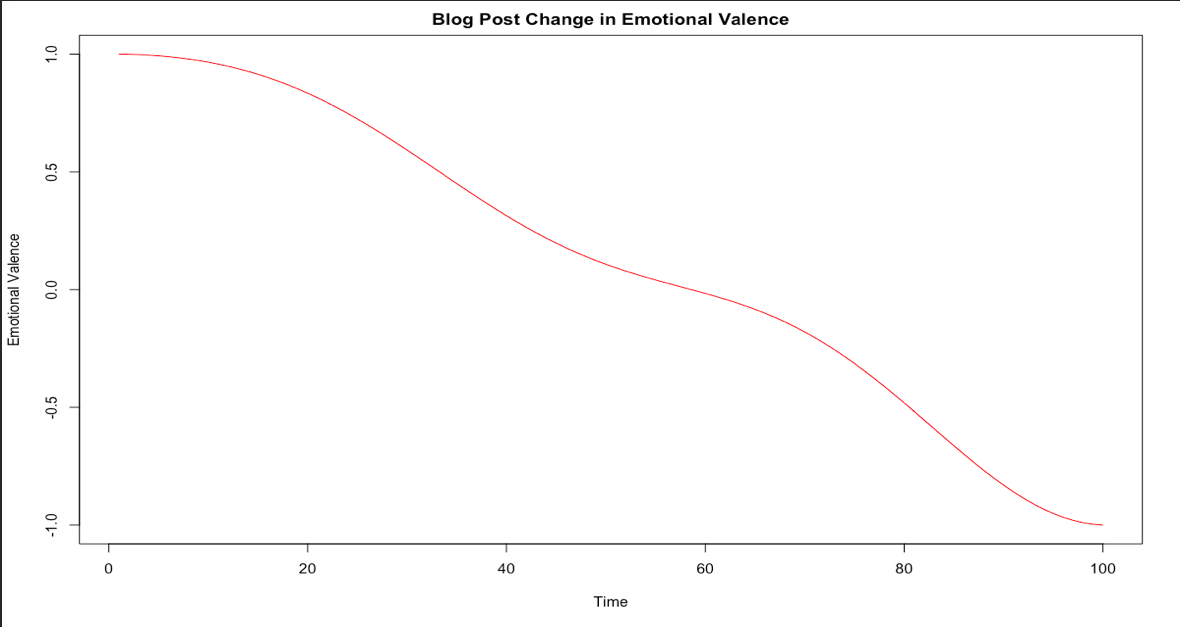
Hmmm… I don’t love that, but it makes sense. My motivation and general positivity have decreased since I began quarantining and this is likely reflected through my activities and thus what I write about. Again, this does not mean that my most recent posts are extremely negative. It just means that compared to my personal baseline in these posts, the more recent posts are more negative than the inital posts. I anticipated this but I was surprised by the severity of the drop and how strictly downward it moves.
Finally, I wanted to do something completely separate: I wanted to use Markov chains to generate text based on the blog posts I’ve already written. If you want to understand Markov chains for text generation, this post does a fairly good job of explaining without getting too mathematical. I will admit, I am no expert in Markov chains, but I find them amusing for text generation and they’re something that I want to learn more about. From a very, very, very high level perspective, Markov chains use probabilities to move from state to state. In this case, each state is a word and we are looking at the probability that a word will follow the previous word. We keep choosing words this way until we reach the desired amount of words.
I used the R package Markovify for this quick text generation. I gave the Markov chain model the following rules:
- only replicate either up to 5 words in a row of the original text (my combined blog posts) OR
- up to 40% of a generated sentence can overlap the original text
- the maximum sentence length is 150 characters
- only give me distinct sentences
Because my corpus is fairly small, the model did not have a lot of training material. This means that the output is very limited in possibility and it probably won’t look like something I wrote. If we gave it the entire Shakespeare corpus, it might be able to replicate his style (to a point), but my ~4,200 words don’t provide much material for the model to learn my writing style. I did it anyway because it’s funny. Here’s an excerpt from the generated text:
Let’s say I’m looking at your phone in the same office every day. For now, I think most young people have a safe place to isolate for two weeks. I think most young people have a safe place to isolate for two weeks. Let’s say I’m looking at your door while you spy from the graph, Rosh Squad exists – to appease Shane. That’s the first week I am in the family. With the quantified self, we’re trying to make GPS tracking more accurate, I don’t have time for that. This is not one but two weeks out of my cute dog, Roshi. This group will soon be moved from the start of quarantine. Mostly, the things that changed around me and I were supposed to go to a party?
So, all of the members are already in a group without Sam? He doesn’t want to be safer with your co-worker. Unsurprisingly, I have an obnoxiously unnecessary number of edges going into or out of hot spots, etc.. Finally, at the first problem. Being as I am in. Two people came in from out of my texting is to my walking pre-COVID.
Samuca and the horizontal line shows the start of week 6. This graph is that I had to.
Unsurprisingly, I have to be in a group to dis her in person.
Pretty nonsensical, but entertaining nonetheless. I wonder how generated text compares sentiment-wise to its training corpus. A project for another time.
This is the fifth in a series of posts From Quarantine. Most posts from quarantine are prompted by Aisling Quigley’s Data Storytelling class at Macalester College. This is one of those posts.